Demetrio Paparoni: Contemporary Chaos at Vestfossen Kunstlaboratorium


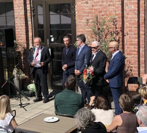
From the opening: Demetrio Paparoni number two from the right.
This year's main exhibition at Vestfossen Kunstlaboratorium is CONTEMPORARY CHAOS and it is curated by Demetrio Paparoni. Paparoni comes from Syracuse in Italy, but today he is living in Milano. He is an art critic and an author in addition to be a curator. He has written many art books which have been published at the well known publish house SKIRA. Recently the book about the Norwegian artist Vibeke Slyngstad was published, written by Paparoni. Morten Viskum is another Norwegian artist who the author found interesting, and in 2016 the book about the artist was published. This book you can read more about here at Samtidskunst.com.
Contemporary art is the art that is created in the present and therefore it reflects our time. Because of that it is an important channel for communication and debate about the world we live in. At first site munch of the contemporary art is difficult to understand, but if you take your time there's a lot to gain through this communication.
In this year's main exhibition at Vestfossen it is, as the title implies, the chaos in the contemporary art Demetrio Paparoni tries to show us. Considering that this art is created as we speak it is difficult to create some kind of overview, and this is what Paparoni indicates according to the title. In addition Paparonni also indicates this in the way he has curated, the works have been put together in a way that can make you confused and surprised. Of course we find Italian artists in this exhibition but it's not in any way dominating. There's a lot of other artists from many countries all over the world.
THE ART
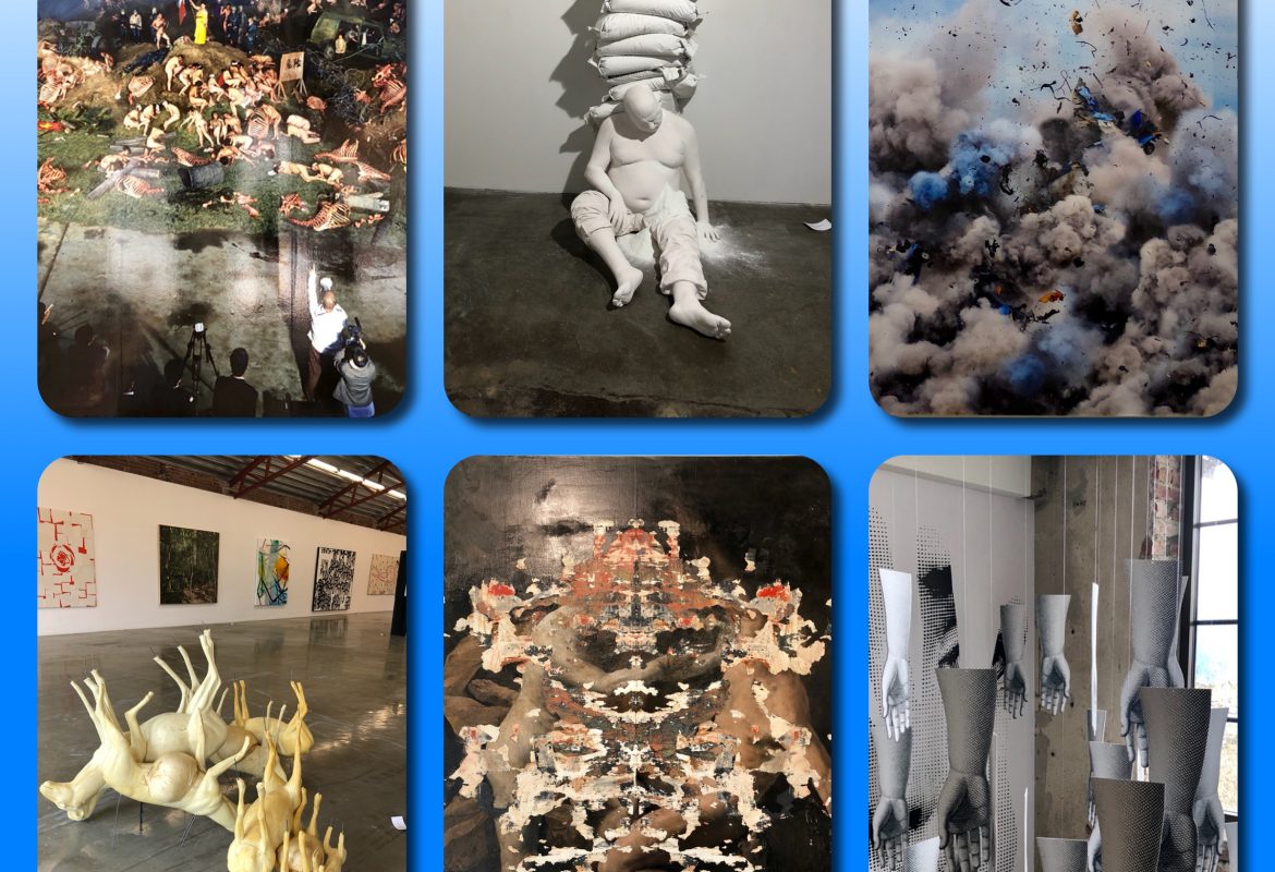
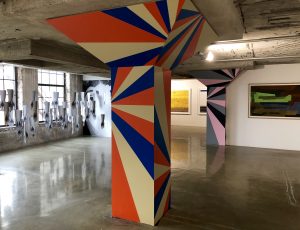 As mentioned before, this exhibition is mirroring some of the diversity in contemporary art, and we see it approaching the place. Looking at the picture, it is not difficult to understand the meaning of it, we go from Alessandro Mendini's Two Columns with their colourful patterns, trying to symbolize diamants, to Valeria Manzi and Barnaba Fornasetti's installation Handmade. In the background we find one of Ljubodrag Andric's pictures, China 9, while to the right, a little bit in the background as well, we find Espen Dietrichson's picture Faint Light #9.
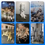
We will try to see if we can find any entirety, reading the exhibition as a whole. But first we will take a closer look at some of the pieces of art. The works presented here have been chosen to show the diversity of expressions, and not because of any favoritism made by this author.
Valeria Manzi and Barnaba Fornasetti
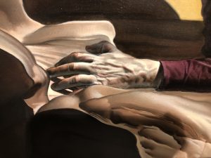
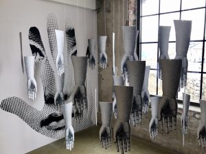 After studying Two Columns your eyes will probably catch the sight of the installation Handmade by the Italian artists Valeria Manzi and Barnaba Fornasetti. The installation is beautiful placed in front of the two windows facing the waterfall, thus the light creates a lovely mood. On both walls at the end we find a woman's face; one of them a part of it seems to be vanished by tearing it apart, while the other one, we can only see a part of it because the face is placed inside a hand. The face, which appears to be very beautiful, turns out to be Lina Cavalieri (1874-1944), an Italian opera singer and actress. She was consider the most beautiful woman in the world in her time, and no one was as much depicted as her in this period.
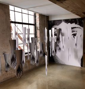 The face became in many ways the icon of feminine beauty, but in what way was it created? According to the title Handmade and all the hands that are hanging down from the ceiling, apparently randomly placed, can we read the hands as a symbol of the creative power?
Looking back at the two faces, we can read the unfinished one as a starting point for the result we find on the other side. Worth noting is that the finished face we find in the form of a hand, and therefore we can feel a little bit claustrophobic because this can be a symbol of a not freely developed face.
In 1960s Twiggy with her thin, almost androgynous body, was a role model for many young girls, and for some of them, with a tragic outcome, because they where starving themselves to achieve the same outcome. Nevertheless, it's the face with the big eyes because of the heavy makeup, and the short cut hair we remember best. But what made Twiggy so popular was an artificially face, constructed with the help of a lot of makeup. It was created to fit the time and therefore the face became iconic. Is there anything similar going on here?
On this link you can read about Piero Fornasetti, Barnaba Fornasetti's deceased father and his fascination of Lina Cavalieri's face and thus the pieces fell into place. This installation is clearly linked to Piero Fornasetti's project. In a reproduction one promotes what pleases one's own and also the time it takes place. A portrait painter or a photographer choose what she or he will emphasize in the portrait. In Norway Håkon Gullvåg and Morten Krogvold can be seen as good examples of this, Gullvåg as the painter and Krogvold as the photographer. Similarly, Piero Fornasetti choosed what he wanted to emphasize in all the reproduced faces of Lina Cavalieri. This installation can therefore be read as the symbolization of this form of transformation, based on the incomplete face, the hands and the finished product.
However, a work of art must be read beyond the artist's intension , and in today's society with the social media where everyone want to appear perfect, we also find the "perfect" human being. They smile or have an interesting expression, searching for the archetype of the perfect person? With that in mind, this installation can make everyone thinking about what's most important, the real or the artificial created, created to achieve an ideal?
Lars Elling
Lars Elling: Babylon
The Norwegian artist Lars Elling's images often have a strong ambivalence. They appear as something that could be very comfortable to look at, but the picture has a strong undertone that creates discomfort. This could cause added elements or beautiful elements that are partly vanished by painted over with seemingly violent and unintended strokes, which give the impression that something has fallen apart. If that is the case, we can read them as highly expressive, as a search for peace, a calm that the artist can't find. We also have to consider that Lars Elling address these tools to the viewer. In that case it must be read as the artist's attempt to bring the viewer out of her or his comfort zone: "wake up and see what is happening around you and do something". Than it became a visualization of Arnulf Øverland's poem "Du må ikke sove" (Do not sleep).
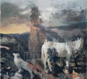
At this exhibition Lars Elling is represented with his work Babel from 2017. Given by the title Elling is calling on the sacred. We are familiar with the story from the Bible about the tower of Babel, when the people tried to build a tower so high that it was to enter the sky. God didn't like this, and that is why people speak different languages, so they cannot understand each other.
Let's keep that in mind when we are studying Elling's painting. Initially it may look like a painting from the romance when it was all about "Sturm und Drang" and where the nature was romanticized. We find the white horse, the horse as a symbol of power, and the colour as a symbol of purity and peace, but it is partly wiped out and thus there is not much power and peace left. We also find a fox with its back partly covered with blood, and a hand pointing in a commanding gest to the fox without appearance of the fox to understand it. The ability to communicate has collapsed like in the tower of Babylon. The white horse can also be linked to the folk tales. Th. Kittelsen painted several versions of The Neck (The river spirit) as a white horse, thus Elling is adding another element of ambivalence to the picture.
Contrasts reinforced each other as known, and as Lars Elling creates a painting that basically has references both to the romance and also folk tales, both of which are folk-hearted elements, and then adds destructive elements as the partially wiped out horse and the fox with blood on his back, the feeling of the destructive becomes extra strong.
For a long time there has been a focus on how we destroy our globe through the environment, and in addition we have the Syriac war in memory as an endless destruction of both humans and nature. Adding this up with the title in this reading, the human being has totally lost the ability to communicate to find a solution:"...Du må ikke tåle så inderlig vel/den urett som ikke rammer deg selv/Jeg roper med siste pust av min stemme:/Du har ikke lov til å gå der og glemme." (Arnulf Øverland: "Du må ikke sove")( ... You must not endure yourself/ the injustice that does not affect yourself/I cry out with the last breath of my voice/You are not allowed to live and forget. Freely translated from Arnulf Øverland's poem "Du må ikke sove" Do not sleep)
Aristoteles divided nature into three categories where people separated from both plants and animals by having intellect and be able to form concepts. Today, many do not seem to be able to use this in a sensible way, and this would even make Aristoteles despaired I believe.
Daniel and Geo Fuchs
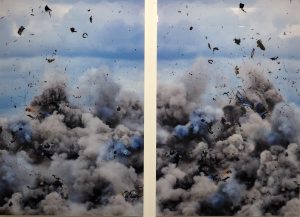 The German artist couple Daniel and Geo Fuchs are in this exhibition represented by the work Explotion I which is a diptych. It is aesthetically beautiful and at the same time it is an explosion and thus creating the ambivalence and the excitement in the work. This diptych has previously been written about here at Samtidskuns.com in connection with their exhibition at Haugar Kunstmuseum in Norway, an exhibition you can read more about by clicking here.
Wang Qingsong
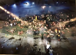 When one arrived at the top floor of the exhibition it was as if Hieronymus Bosh had taken the stage, but what in the world had this picture of an artist who lived hundred of years ago to do with contemporary art ? Nothing at all it turned out, because it was the Chinese artist Wang Qingsong's work the Blood of the World who had given such associations. It looked like the battlefield it was supposed to be.
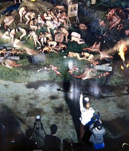 Looking at a section of the picture we find a person that stands out with something that can be perceived as a microphone, while people are spread beyond, naked and apparently dehumanised in different twisted position, surrounded by cadres. At the center of the big picture we find someone standing upright with something similar to a flag, which can be associate with Delacroix's famous painting La Liberté guidant le peuple (Liberty Leading the People). It may take a moment before we discover the spotlight in the ceiling, and thus we realize that this is a staged situation and the person with what we first perceived as a microphone, directs it all. Before you realize it, you can think of it as a reportage from one of the cruel events that takes place in the world at all times.
Wang Qingsong himself tries to reproduce a previous work of a calculated battlefield which also could be linked to Delacroix's painting. Regardless, this picture that fill almost the whole wall, can get anyone familiar with the feeling of sadness and despair because one can not help thinking about all the people who have suffered and still are in the world today. "Du må ikke tåle så inderlig vel...."(You must not tolerate very well....)
Nicola Verlato
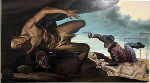 In the spirit of postmodernism Nicola Verlato is looking to the history of art in his work The Cave IV. What immediately comes to mind is how the main character in the picture can associates to Caravaggio's painting The Crucifixion of St. Peter. But the inequalities are greater than the similarities. The main character in this picture is not going to be crucified, on the contrary a cowboy is trying to kill him by shooting him. The persecuted should have the face of Raphael while the cowboy should be linked to Jackson Pollock. The renaissance meets abstract expressionism in other words.
 You can read a lot out of this picture, and it is also worth looking at all the details.
Anne Samat
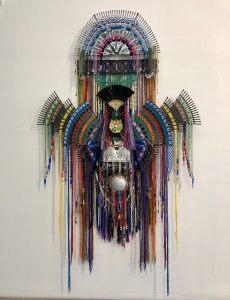 Anne Samat is from Malaysia and she is represented with the installation Freedom 8.... For Every Person to Worship. From a distance it looks very aesthetic with its clear shapes and tuned colours, colours we associate with something positive. It is easy to link it to indigenous people like Sami, Indians, Aborigins etc. given by both shape and choices of colours.
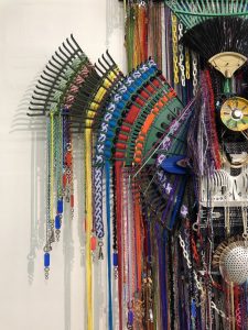 Approaching the work, most people will be surprised, because the work itself is build up of objects we expect to find in the kitchen or in the garden. These are objects that we use every day without giving them much value. Anne Samat takes these objects out of their natural context and put them together into an aesthetic peace of art.
We can wonder, what does Anne Surat express through this piece of art? My thoughts immediately went to the Russian artist Ilya Kabakow who meant that what was rubbish for someone was precious treasure for others, thus he took object into art that immediately didn't seem to be called art. Another association you can get is Duchamp and his readymades.
But it is other themes that concider Anne Samat. She is concerned about both discrimination and religious oppression. This applies not only to oneself, but also what is happening elsewhere in the world. Keeping that in mind, it is easy to read the work symbolically. If all people get equal value and the dogma disappear, anyone can become beautiful regardless of the starting point.
Ghazaleh Avarzamani
Ghazaleh Avarzamani: Game of Goose
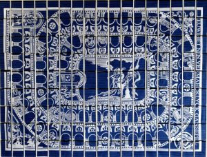
Ghazaleh Avarzamani is from Iran but today he lives and works in Canada. In this exhibition Avarzamani is represented with the work Game of Goose. It is a large piece of art: 258 x 198cm and as the title suggest this is about a game. It is one of the oldest board game in the world, and it has laid foundation for further development to similar games. The rules of the game are diverse from place to place, but they have also had an uplifting purpose.
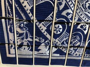 In this game the boards can have different design and Avarzamani's edition is richly illustrated with a pattern that can be associated with Persians pattern, which adds an extra dimension because Persians patterns are consider to be particularly beautiful. This board has a blue bottom with white pattern. The bottom is made by 180 pieces of cloths. These are actually washcloths, using to wash away stains etc. We thus find an ambivalence in the image, the beautiful pattern can easily disappear if the washcloths return to their true function. Similarly is a game as uncertain as the upbringing function that this game also has been used to: The one who is in power and is going to raise may gladly be raised. Power is an uncertain power which has to be used with humility and justice, because the balance of power can quickly turn, just like winners and losers in a game.
Paola Angelini
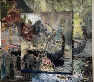 Paola Angelini is an Italian artist, but in 2016 she stayed at Nordisk Kunstnarsenter Dale. The artist became inspired of the Norwegian during her stay, and her work La storia che mi ha raccontato mio padre (The story told by my father) is a result of this. It is a large canvas with even a smaller one outside. The drawings are a little naive and the colours reinforce this expression. Looking closer we also find an ambivalence in this piece of art, but it is for each and every viewer, depending on their background, to find out what the ambivalence is all about.
Conclusion
Despite the fact that there are many more works that should have been presented in this text, it has been, as mentioned before, my intension to show the diversity in this exhibition, to support the title Contemporary Chaos. Basically approaching an exhibition with contemporary art, you may feel a bit overwhelmed, given by all the very different expressions, but take your time, look at one piece of art at the time, than try to put them in the context and you will find it much more easy to read them. If we are trying to find a kind of entirety based on the works presented here, it must be that they all, in different ways comments on what is going on in the world today, often by indirect criticism against systems of suppression, environmental crises, war, etc. We also find in several piece of art a longing back, back in time when you was too young to know about all the injustices we find in the world. One thing though is for sure, by renouncing the contemporary art, one will miss an important voice in the social debate, both nationally and internationally.
With the art of Paola Angelini the ring between Italy and Norway has ended for this time, Angelini creating art inspired and created in Norway, and last but not least Demetrio Paparoni as the curator of the exhibition and Morten Viskum as artistic director of Vestfossen Kunstlaboratorium.
A complementary catalog has been created where you can read more about the art works and the artists which have created them. Last day for the exhibition is September 23rd.
In addition you will also find both Østlandsutstillingen (the exhibition from the east of Norway) and the exhibition NOE MAA GAA I STYKKER (something has to fall apart) with Sverre Bjertnæs and Bjarne Melgaard at VKL.
In addition to my own knowledge I have used the exhibition catalog as a support.
As always when nothing else is stated, it's my own photos.